The Challenge
The Spring/Summer 2014 Collection offered a colourful range bursting with vibrancy, special prints, rich fabrics, new fits, sporty silhouettes, cool graphics and fresh washes. The design challenge was to translate the theme of the collection into an intuitive and aesthetically appealing shopping experience that seamlessly integrated into the existing e-commerce platform.
My Role
Art Director, User Experience Designer
(research, interaction design, visual design, branding)
(research, interaction design, visual design, branding)
Research
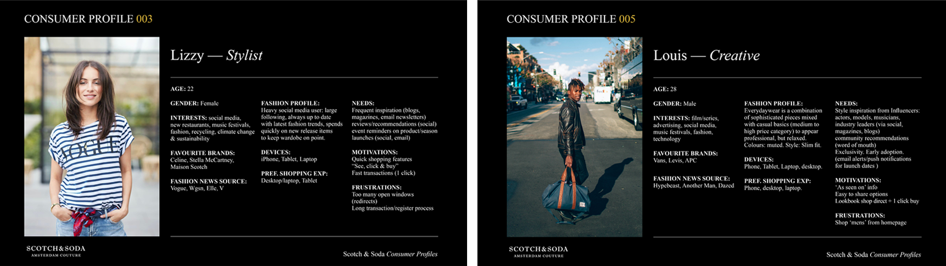
Buyer Profiles
From our key demographic we created a series of buyer profiles that defined the motivations, needs and frustrations when browsing and shopping our website.
We understood our users were looking for a single shopping experience that facilitated a 1-click buy without redirecting to external pages.
We understood our users were looking for a single shopping experience that facilitated a 1-click buy without redirecting to external pages.
Wireframes
Approach
After identifying the common needs of our users, we built
mid-fidelity wireframes that contained the shopper experience to a single scrolling page, keeping the user engaged on the content while offering the full webstore shopping functionality in pop up overlays.
mid-fidelity wireframes that contained the shopper experience to a single scrolling page, keeping the user engaged on the content while offering the full webstore shopping functionality in pop up overlays.
Design
UI Kit
I created an interactive UI kit encompassing all components and UI elements used. Using the master S&S branding guidelines as the foundation, I added components such as buttons and navigation menus, typography guidelines, and new button states created for the shopping overlays.
Typography
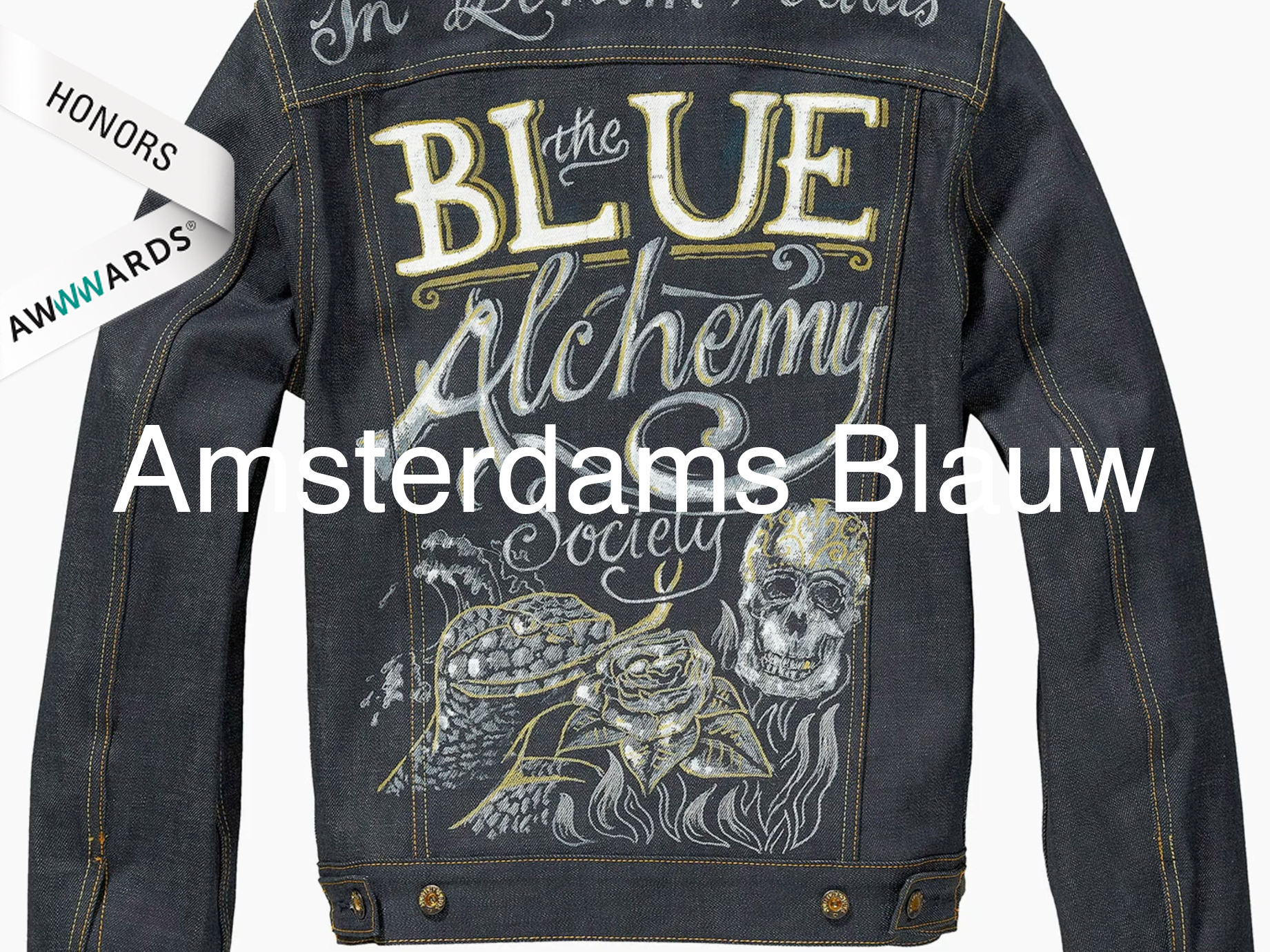
Custom handwritten typography was created in-house with the S&S creative studio. Handwritten elements were an important part of the S&S style guide, here they would animate in over the product images to break the grid structure of the product image layout.
Prototype
High Fidelity
The final prototype showcased the final transitions, typography, and pop-up shopping functionality. The project stakeholders could navigate the collection using menus, interact with the product imagery and simulate
the buying experience.
the buying experience.
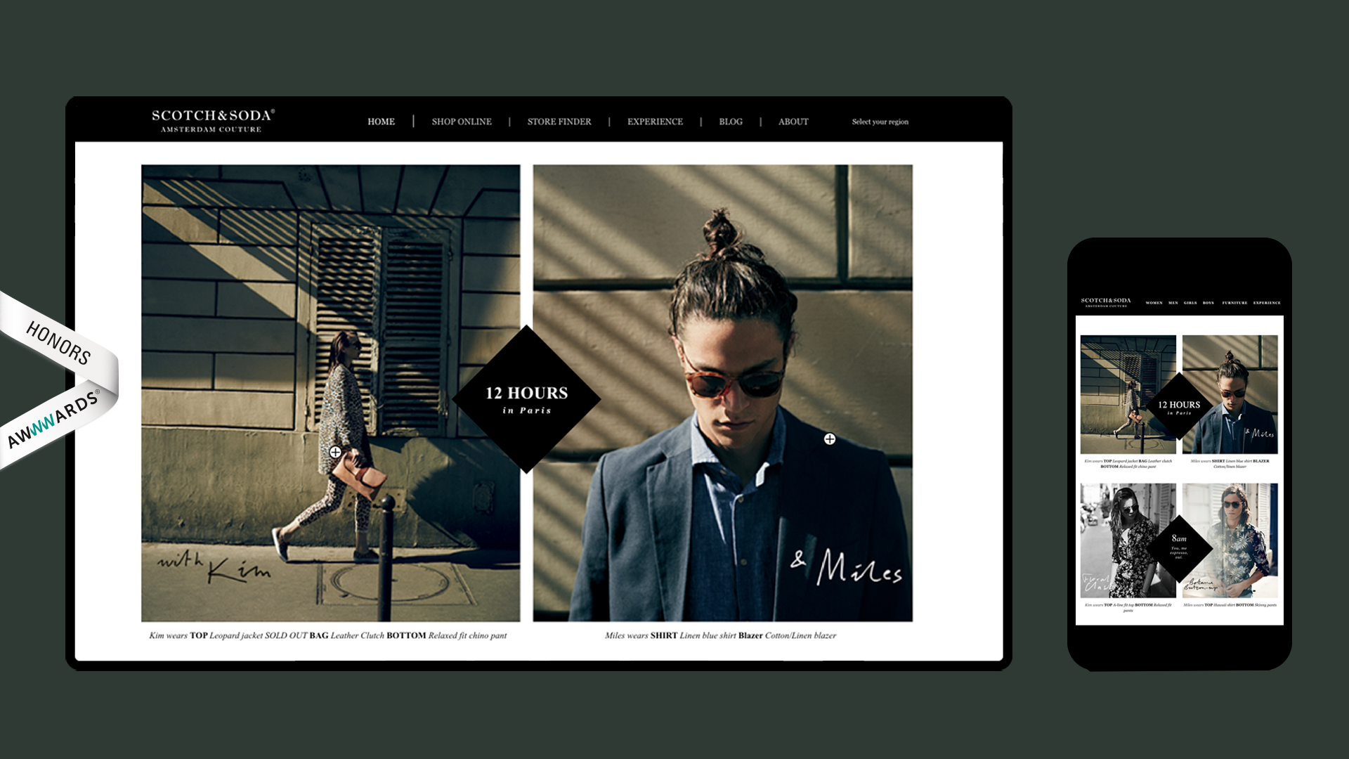
Final Design
Our final design consisted of a single scrolling page navigated by clicking, or using the arrow keys. As each set of images loaded, handwritten typography animated over and product links faded in. The campaign film and '12 Hours in Paris' location map were integrated into the experience to enhance interactivity and support the campaign narrative.
Results: Impressions, engagement and average order value increased. Reach was high, most users clicking through from email campaign notification. Heat-map testing indicated high user retention within the experience.
Credits:
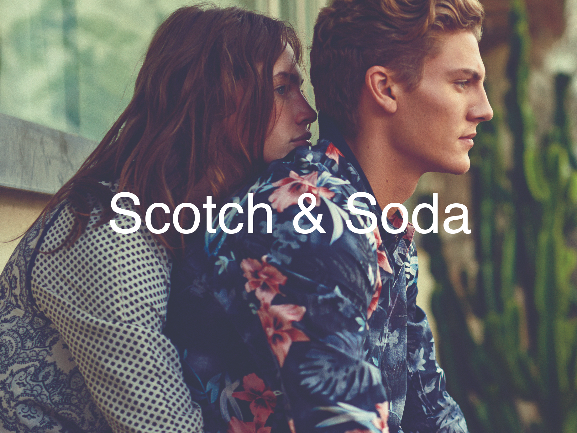
Design: Scotch & Soda
Photography: Annemarieke van Drimmelen
Developer: codeclear.nl
Photography: Annemarieke van Drimmelen
Developer: codeclear.nl
Awards:
☺